Episode 008: 99 Cent
In which we discuss AI, dusty drum loops, and cheap candy
All the recent hoopla about AI and ChatGPT and whatnot has me thinking about all the ways technology is used by both good and bad actors to manipulate and create art to make it appear to be something it isn’t. Some examples:
There is no way to know if anyone is a good singer anymore…autotune and other digital editing tools make it impossible to tell.
After a few hours of Photoshop videos on YouTube, or about 5 minutes on Canva, you can make an image look like pretty much anything.
Grammarly makes everyone sound like they have an MFA.
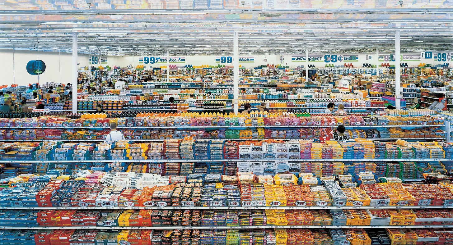
All of this brings to mind Andreas Gursky, one of my very fav photographers. He masterfully manipulates images to increase their scope and create fascinating patterns. They LOOK real, but upon closer inspection, you realize that they aren’t. He’s fooling us.
One of his most well-known works is ”99 Cent”, a biting commentary on consumerism.
Since this photo was taken in the (albeit late) 90s, I immediately thought of using some old, dusty drum loops to give the beat 90s Hip-Hop vibe. Now, of course, this beat sounds nothing like actual 90s hip-hop, but I feel the bones are in there somewhere.
I went for that old sampled and chopped-up feel… but inspired by Gursky, I also wanted it to sound bigger. So I took the same loop and doubled it on a second track, this time something like a third or fourth higher. The drums kind of blend together into one sound, but you can definitely hear that the yelling in the background is now harmonized.
A little trick in making the theme stand out once the full beat kicks in: I changed piano sounds to something less garbled sounding. Also raised it a half step.
Very happy with the piano solo in the breakdown. The final descending line sounds like a glissando, but it is me just burning down a scale pretty fast and then playing it again a half step higher.
I know that a warehouse-sized 99¢ store like this doesn’t really exist, but man, the photo gets its point across.
I mean, that is a LOT of 99¢ candy.
I continue to closely inspect this photo to try and find any recurring designs or forms to see where he manipulated things, but it’s so good, I just can’t tell.
Gursky’s patterns and repetitions really appeal to me. Plus, this photo is custom-made for one of my reductions. I tried to focus on the depth and the never-ending repetitive vibe of the original by increasing the number of boxes on each line by one, decreasing the size of each box, yet keeping the same repeating 1-2-3-4 color sequence.
Very bright primary colors here.
One of the best commentaries I’ve ever read on consumerism is Slavenka Drakulić’s 1991 collection of essays How We Survived Communism and Even Laughed.
Her description of coming to New York for the first time from communist Eastern Europe and seeing a supermarket with a dozen varieties of simple commodities that we take for granted is worth the price of the book alone.
I can’t even imagine how her head would explode walking into Gursky’s 99 Cent store vision. Mine would.
Until next week, thanks for reading Polyester City. If you have any thoughts, please leave a comment by clicking the link above. If you know anyone who likes Music and Art and Stories [and candy], which is pretty much everyone, please consider sharing by clicking the link below.


Nice reduction.
DIG. Nice work